The recent introduction of Performance Analysis just made our SimGrid Pro package more attractive. What’s behind the paywall? Well, there is an entire world to discover for teams and drivers looking to enhance their performances! The tool has multiple functions, so let’s break them all down in detail.
Performance Analysis UI
Despite having a lot of precise info, the Performance Analysis is easy to use and designed to move between pages with minimal clicks. Users are not only able to access all the data from different races and championships but can also directly visit the host and event pages. The bar at the top features:
- Performance Analysis
- Host name
- Championship name – by clicking on it, the user will have direct access to useful data (Event Info, Scoring, Races, Results, Standings, Teams)
- Event – gives the possibility to switch between the different rounds included in the championship
- Session – particularly helpful in championships with doubleheaders on the same track
- Class – allows for dividing the field as per categorization
- My events – located at the top right of your screen, it gives you quick access to all the events you have been part of
The second bar mainly summarises the event details, giving information about the event format (solo, team), the simulator used (by clicking on it, you will be redirected to the events page on The SimGrid website for that specific sim), the track and the date and hour of the event. But the main feature of the second bar is on the left and gives access to two different menus: grouped analysis and leaderboard analysis.
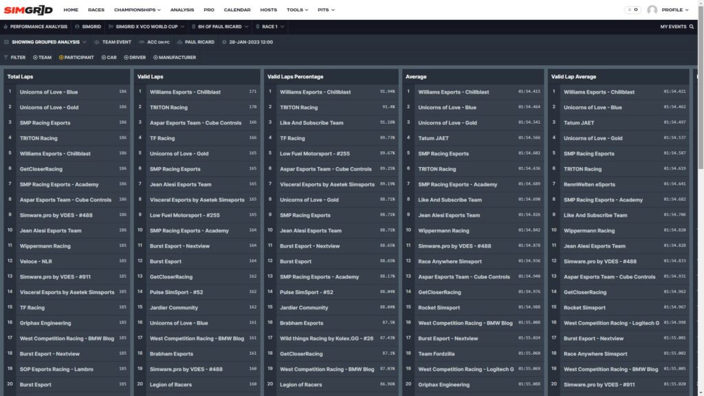
Grouped Analysis
The grouped analysis screen contains not only important data but some great gems dedicated to the most statistically-minded people. This menu contains standings of the following categories.
- Total Laps
- Valid Laps
- Valid Laps Percentage
- Average
- Valid Lap Average
- Best Lap
- Optimal Lap
- Standard Deviation
- Valid Lap Standard Deviation
The standings can be filtered by teams, participants (every single entry), cars, drivers and manufacturers. Five different types of data views to dig in to analyse past races.
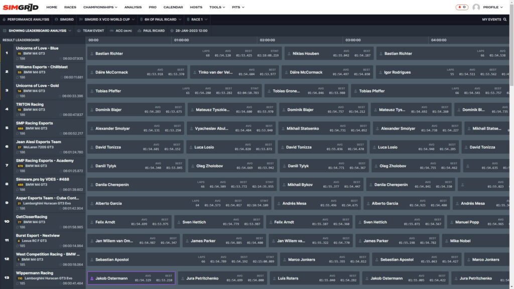
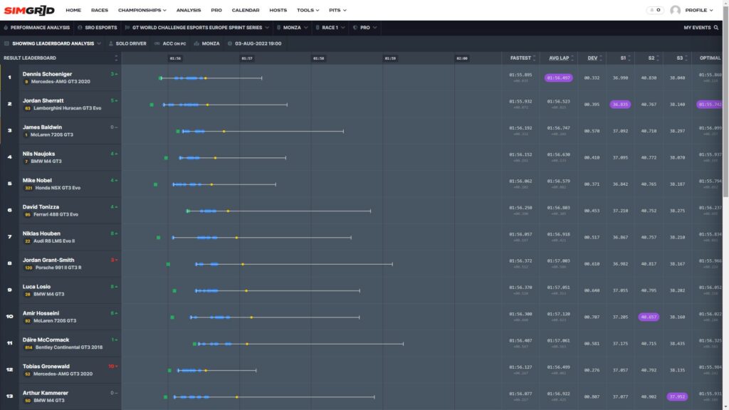
Leaderboard Analysis
The leaderboard analysis screen differs based on the event format (solo or teams), but both visualisations have something in common. The tower on the left displays the main info about the entry: final position, team/driver name, car model and number, laps completed and total time.
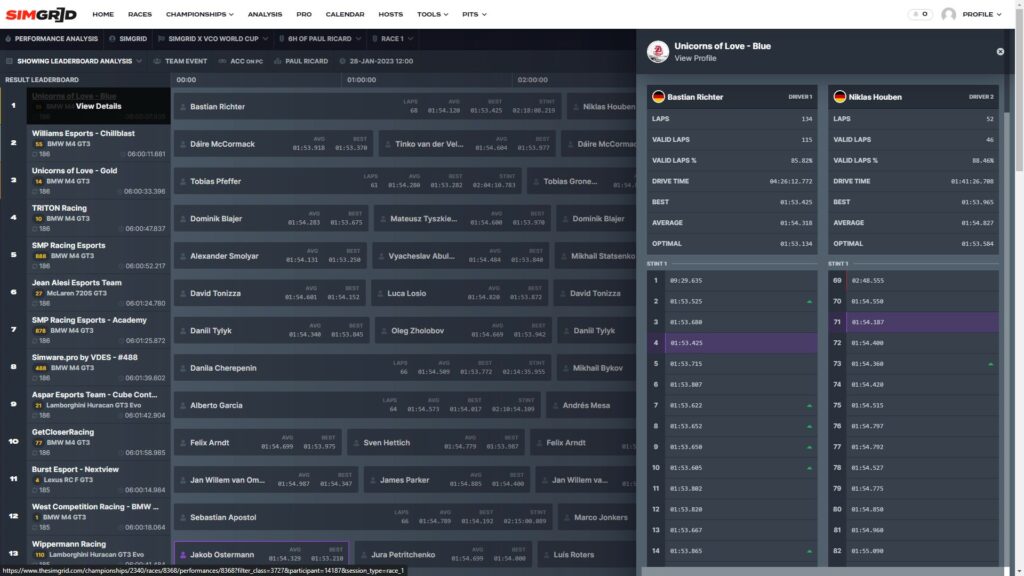
Moving your cursor over the entry’s name makes it possible to click on “view details”. This option gives access to another menu full of vital stats for your post-race debriefing. At the top of the page, there is a summary for each driver, which includes the following:
- Qualifying, finishing position and difference between the two values (solo drivers only)
- Total laps number
- Valid laps number
- Valid laps percentage
- Drive time (teams only)
- Best lap time
- Average lap time
- Optimal lap time
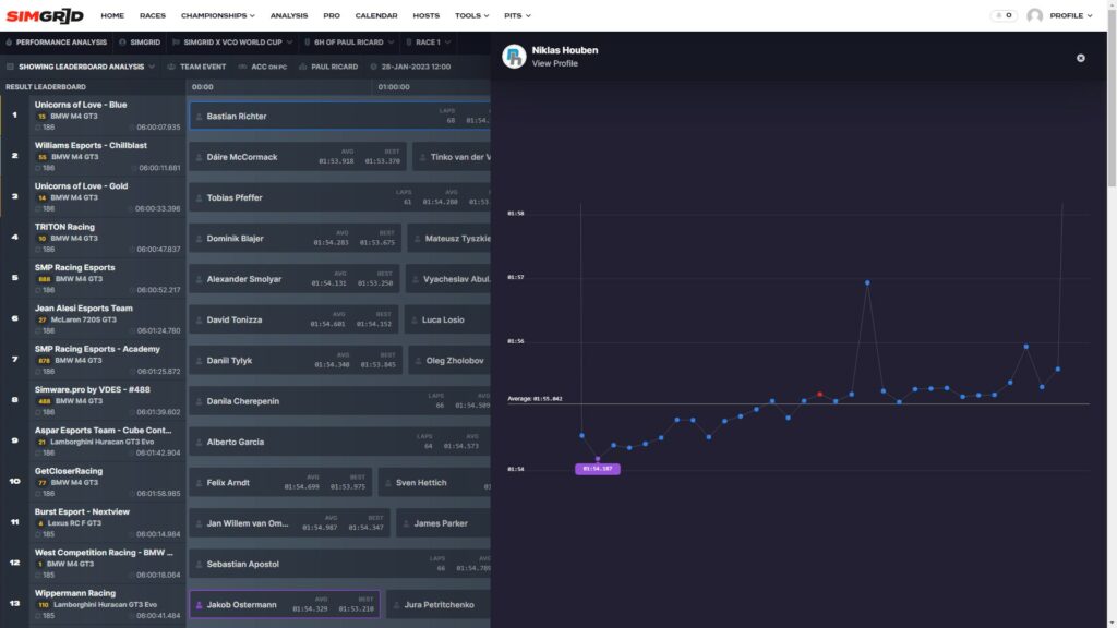
Right below, users can find a detailed view of every lap and a chart at the bottom of each stint to give a different perspective.
Each stint puts together all the lap times registered in a column. The lap number is displayed on the left.
A red sign highlights invalid laps, while a purple one indicates the fastest of the stint. A green or red arrow on the right displays a gain or loss of position.
At the bottom of the column, a chart can be expanded by clicking on it. The horizontal line represents the average lap time, while the dots keep track of every time set. Hover over each dot with the mouse to see the laptop. Invalid ones are marked in red.
Solo and Teams differences
Taking a step back from the detailed version and returning to the leaderboard analysis page, we can find the main differences between the solo and team visualisations. The purpose is to highlight the most important info for a race depending on the format (sprint or endurance).
Solo drivers
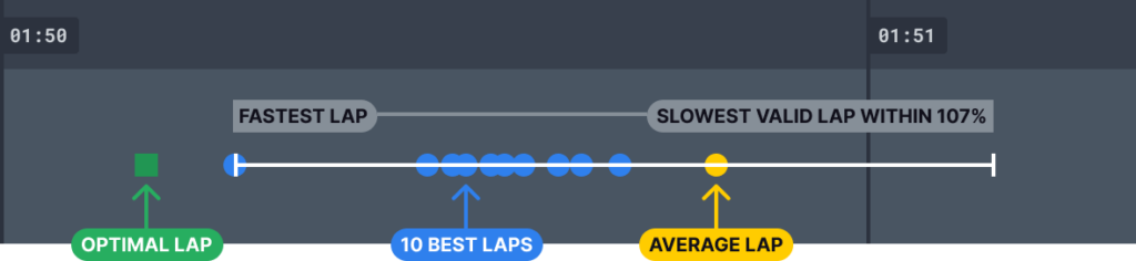
For solo drivers, the main focus is on pure speed. In the middle of the screen is a box plot indicating the slowest and fastest lap of the race set by each driver. The shorter the bar, the more consistent a driver has been.
The bar also features some coloured dots that give further depth to the information handed out. Purple dots represent the ten fastest laps, while the yellow dot is the average lap time. On the left of the bar, a green box indicates the optimal lap time, showcasing the potential of the racer. Other detailed info, such as sector times and optimal lap, can be found on the right.
The columns on the right of the screen translate the graphics into numbers. But the standard deviation column is the one that stands out. Standard deviation tells how much a driver has been consistent throughout a stint. Generally speaking, the lower the value, the greater the performance of the target driver. That number tells how much a driver has been off compared to their average lap time.
For example, with an average lap time of 1.56.500m and a 0.500s standard deviation, we can expect to find lap times included in the 1.56-1.57 range when opening the detailed stint screen. Of course, there will be some exceptions because standard deviation removes any anomalous lap time from the calculation.
Teams
The team’s event screen is built for horizontal navigation. Each box represents a stint, and the main info, such as laps completed and average and best lap times, are displayed there. Different stints can be compared by clicking on the team’s name in the column on the left. This page allows teams to compare teammates’ paces for data analysis and bragging rights.
But there is much more. From there, team managers can have an overview of each driver’s performance (with fastest, average and optimal lap times) and a breakdown of each stint’s performance – including the lap graph we have already covered in the solo driver section.
Why is Performance Analysis important?
‘Practice makes perfect’ is always a nice and truthful saying, but you might need more to step up your game in Sim Racing. While on track, you might have a feeling that could be proved wrong by data. Of course, some racers may prefer to spend time putting in practice laps rather than looking at some numbers on a screen, as they might perceive it as a waste of time, but we can assure you that it’s worth it.
Using a Performance Analysis tool might take away some time and laps, but the long-term benefits make that extra work worth it. Studying race data is one of the best ways to understand our weaknesses and turn them into strengths. They are important for each driver and team, as they can be used to work on the race plan strategy-wise.
Team Managers might also use Performance Analysis for internal and external scouting purposes. It gives them a chance to analyse both the performances of their own drivers, but at the same time, it will help them judge new drivers who they may want to sign to their team by looking at all the data handed out by the tool.
The Performance Analysis tool is part of the SimGrid Pro package, which includes other useful features such as driving statistics and a calendar feed and guaranteed access to Pro Only Events at $1.99 per month. Teams can save money by subscribing to teams’ dedicated package, which gives access to all the features for up to 5 drivers.